Black Market Flea is a Los Angeles–based cultural platform celebrating Black entrepreneurship, creativity, and community. Through a monthly, all-ages marketplace, the event brings together independent vendors, artists, and innovators in a space that prioritizes accessibility, participation, and cultural exchange. As the platform continued to grow offline, there was a need to establish a digital presence that could extend its reach, document its impact, and support ongoing engagement beyond the physical market.


The challenge was not simply building a website but creating a brand foundation where one did not yet exist.
Black Market Flea had no formal visual identity or digital system to guide consistency. The risk was either under-designing and lacking clarity or over-designing and stripping away the organic, community-driven energy that defined the platform.
The work needed to introduce structure without imposing control.

The strength of Black Market Flea lies in its people — the vendors, visitors, and shared moments that shape the market each month. Any rigid or overly polished identity would compete with that reality rather than support it.
The strategy was to design a lightweight, flexible brand system that acts as infrastructure, providing rhythm, clarity, and coherence while allowing community content to lead.
Strategic principles

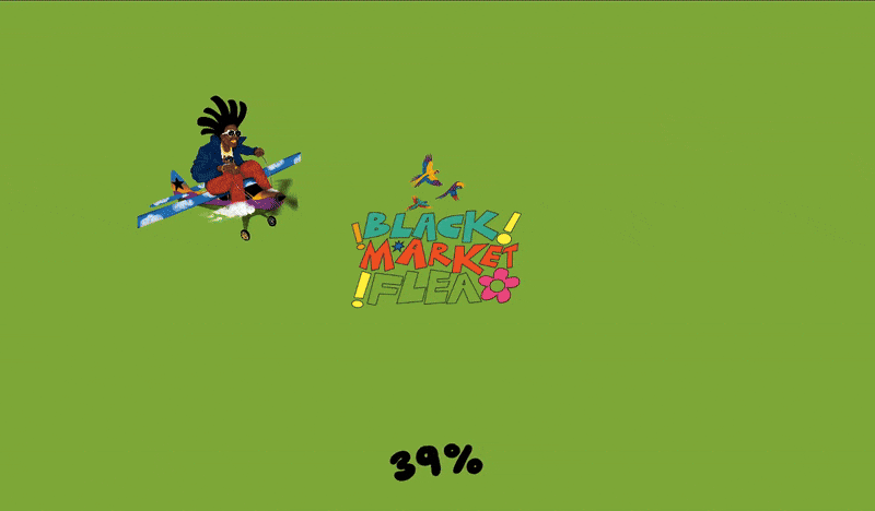
.gif)
The website serves as both an informational hub and a cultural extension of the physical market.
The experience mirrors the in-person event: open, welcoming, and shaped by participation rather than polish.


The challenge was not simply building a website but creating a brand foundation where one did not yet exist.
Black Market Flea had no formal visual identity or digital system to guide consistency. The risk was either under-designing and lacking clarity or over-designing and stripping away the organic, community-driven energy that defined the platform.
The work needed to introduce structure without imposing control.
The strength of Black Market Flea lies in its people — the vendors, visitors, and shared moments that shape the market each month. Any rigid or overly polished identity would compete with that reality rather than support it.
The strategy was to design a lightweight, flexible brand system that acts as infrastructure, providing rhythm, clarity, and coherence while allowing community content to lead.
Strategic principles
The website serves as both an informational hub and a cultural extension of the physical market.
The experience mirrors the in-person event: open, welcoming, and shaped by participation rather than polish.